Sprinkle and Sprout

Brand Identity & Campaign
Project Overview
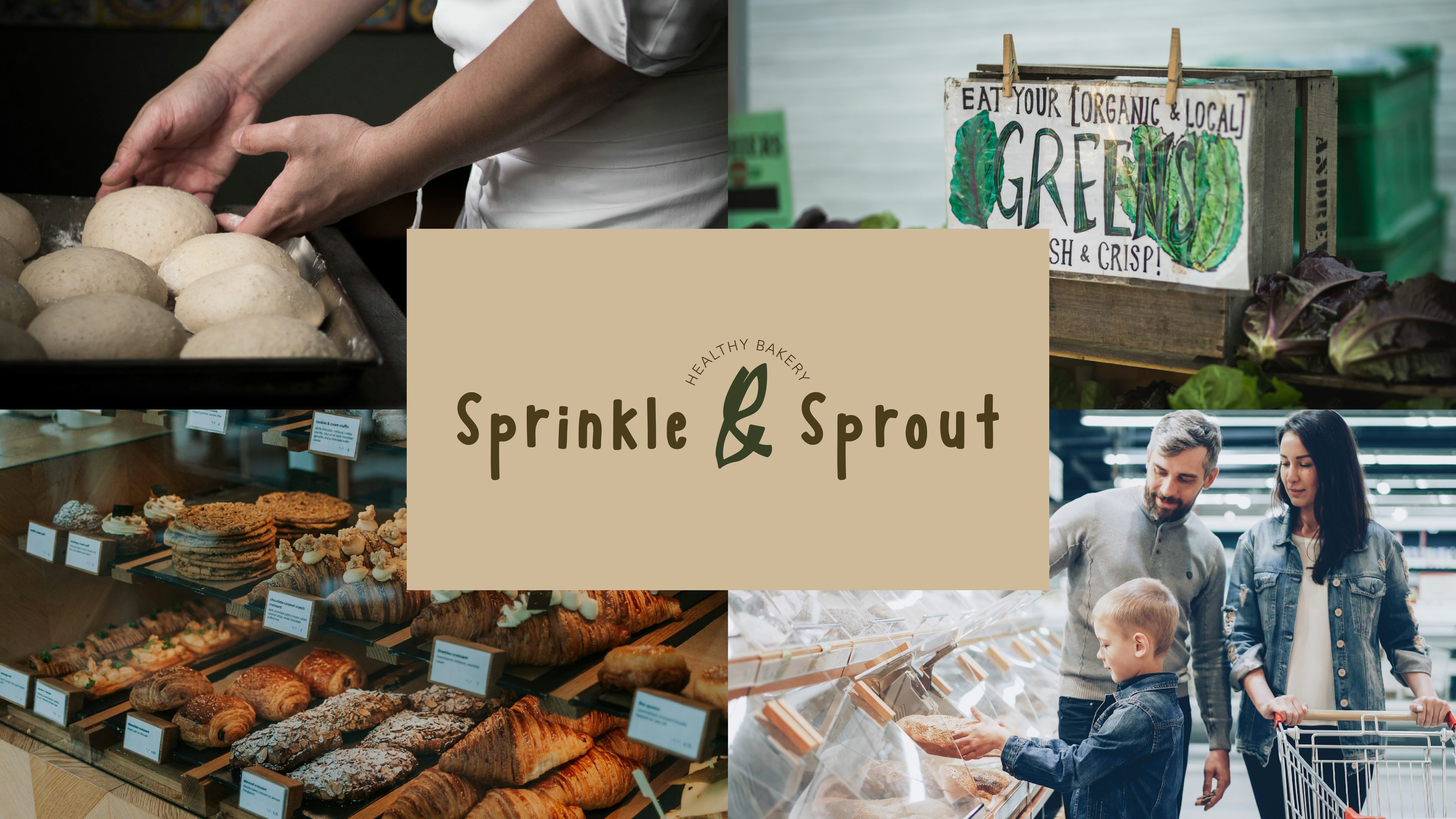
Sprinkle and Sprout is a conceptual small local bakery located in the Bay Area. The brand focuses on creating health-friendly desserts, pastries, and drinks using seasonal, locally sourced ingredients with reduced artificial sugar.

This project developed a complete brand identity and marketing campaign that balances healthy living with affordability and joy, making mindful eating accessible rather than restrictive.
Goal
  • Create a friendly and approachable health-focused bakery brand
  • Promote mindful eating without guilt or pressure
  • Communicate eco-friendly and community-driven values
  • Develop a complete brand identity and campaign system
My Role
Brand Designer (Individual Project)
  • Brand strategy and concept development
  • Logo and mascot design
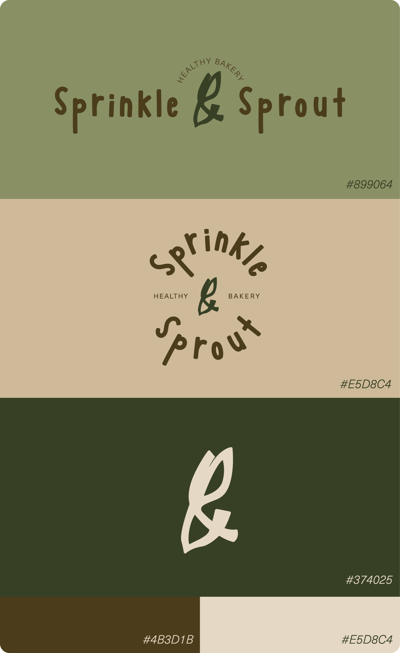
  • Color palette and typography selection
  • Visual identity system
  • Campaign and marketing concept
Design Concept
The brand is built around the idea of self-love through mindful choices—enjoying desserts while caring for health and the environment.

Sprinkle and Sprout challenges the assumption that healthy eating must be expensive or joyless. Instead, it presents wellness as warm, playful, and achievable for everyone, including families and children.
Key Design Decisions
Brand Identity
  • Selected CS Mortise, a serif typeface with handwritten characteristics, to evoke a playful and childlike tone
  • The typeface reflects curiosity, warmth, and the simple joy of eating
Logo & Mascot
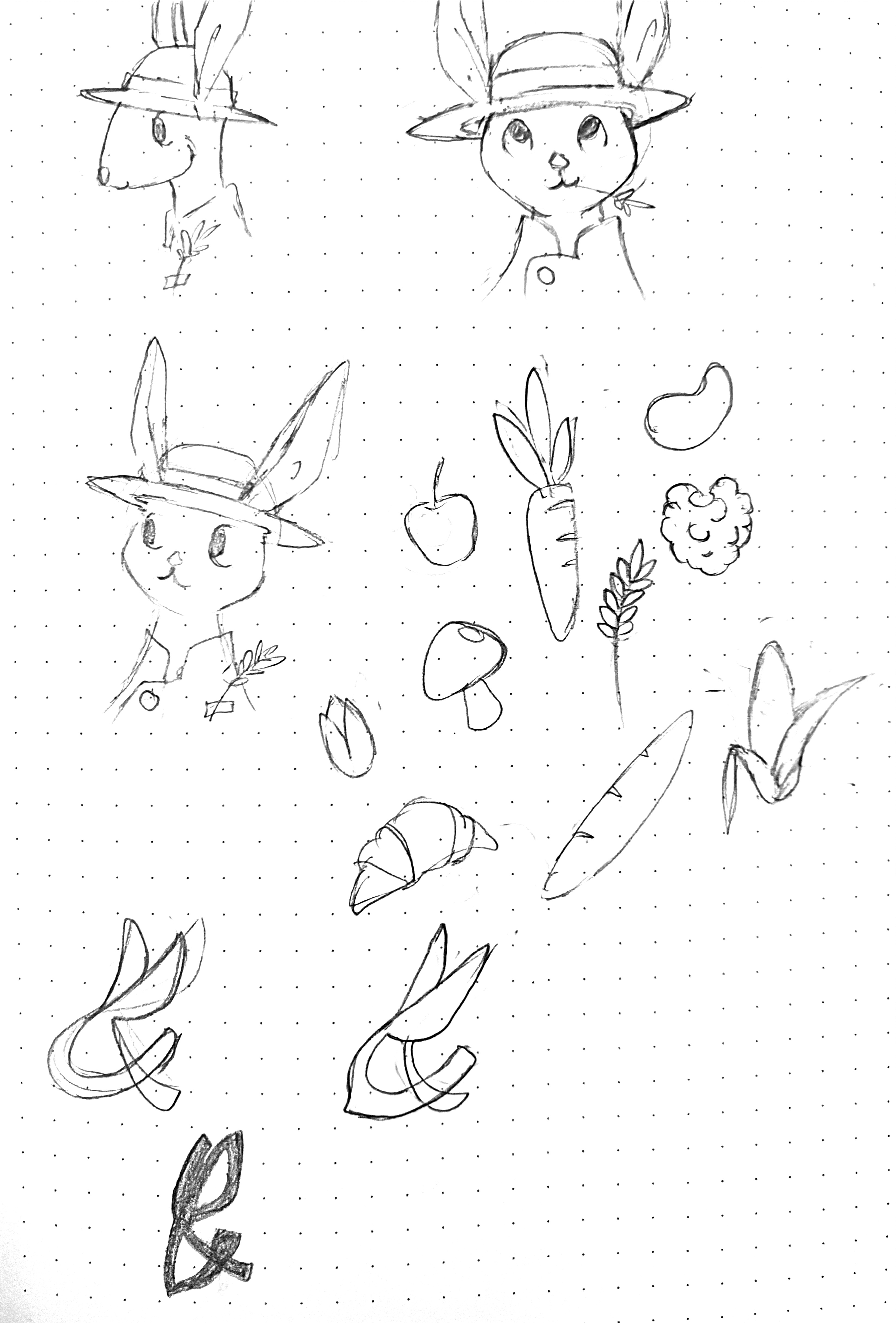
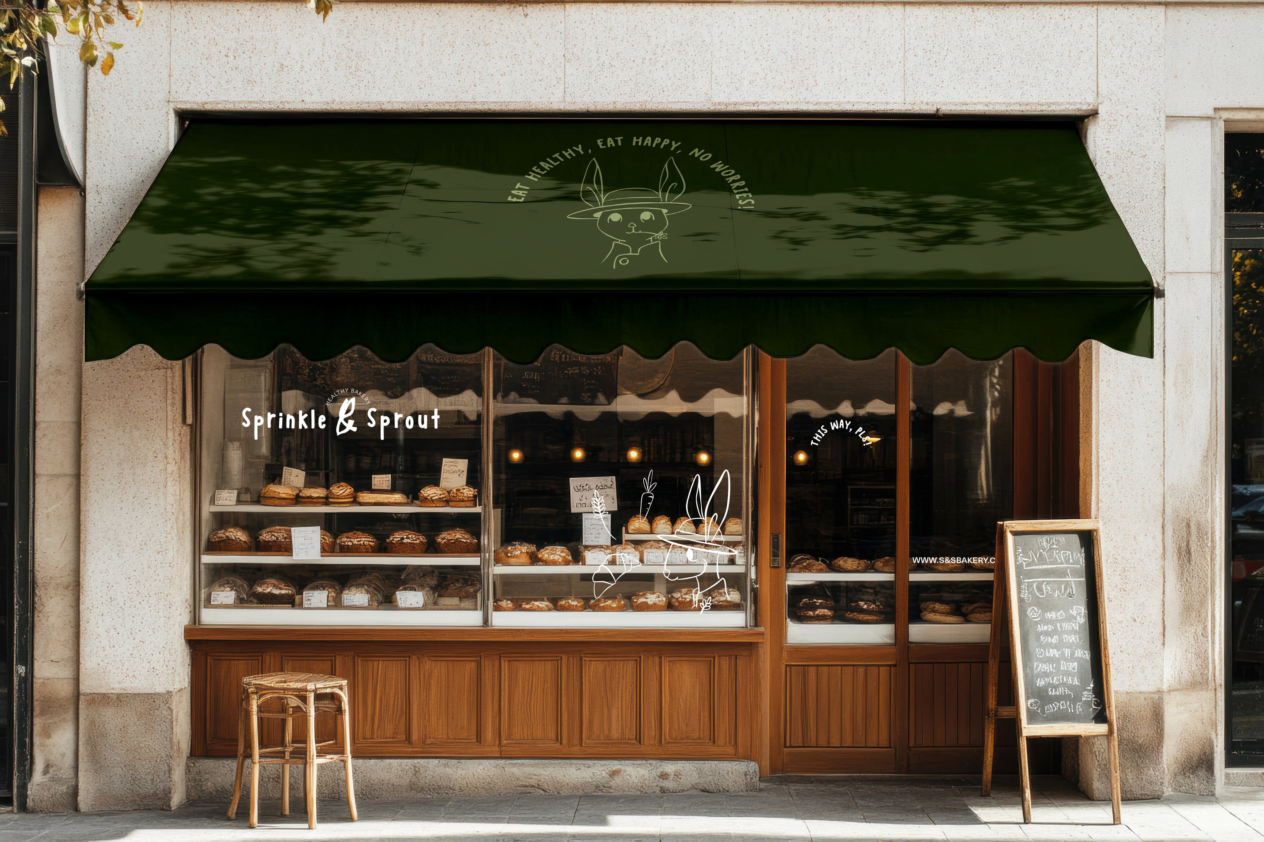
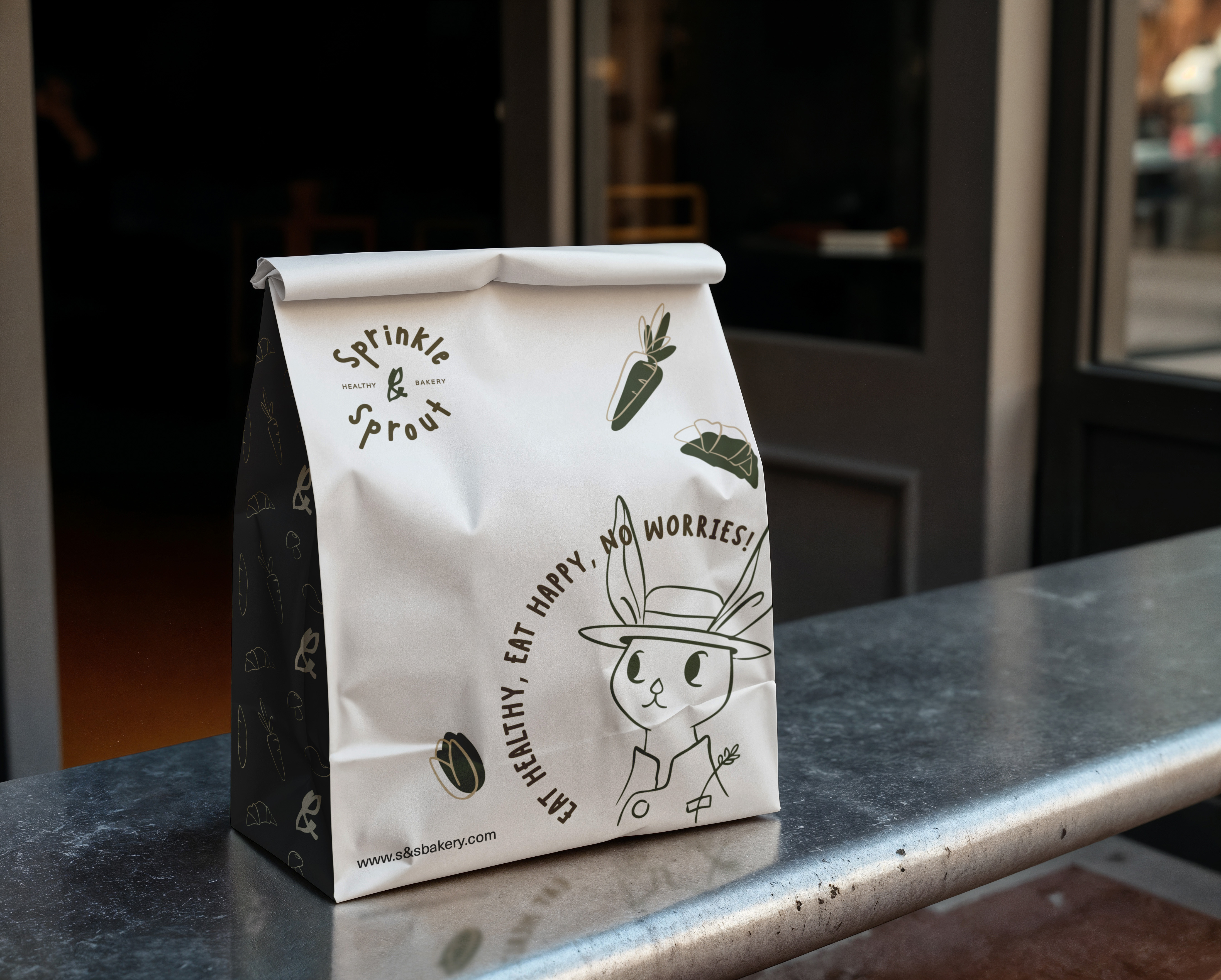
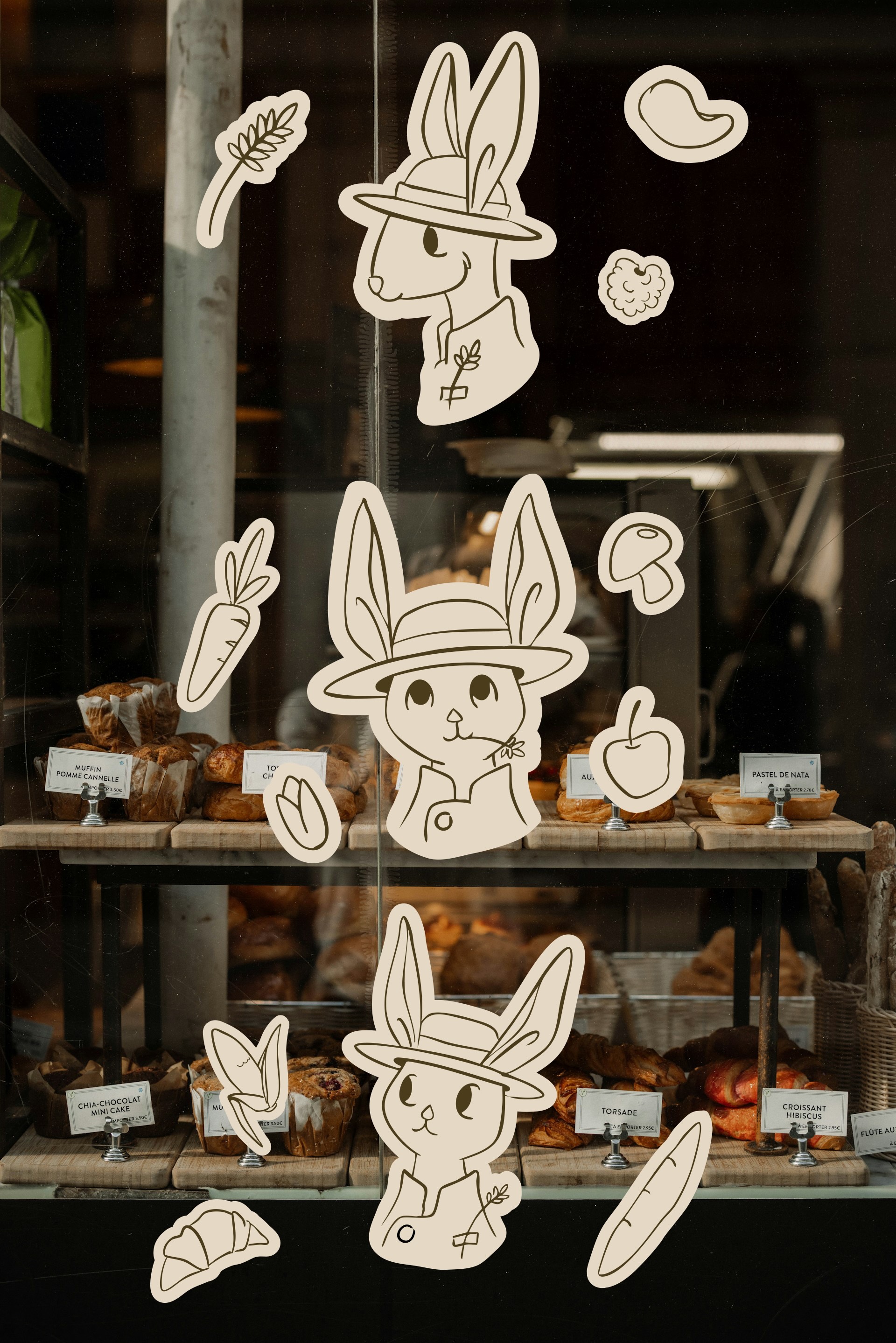
  • Customized the ampersand into a brand mascot named Leafy, a friendly bunny
  • Leafy communicates brand values in a fun and approachable way, especially for younger audiences
  • The mascot helps humanize the brand and build emotional connection
Color Palette
  • Earthy tones including brown, light green, and khaki
  • Colors reflect nature, cleanliness, and safety
  • Supports the brand’s eco-friendly and health-conscious message
Brand Voice
  • Warm, encouraging, and reassuring
  • Brand voice exploration: “Eat Healthy, Eat Happy, No Worries!”
Marketing & Campaign Strategy
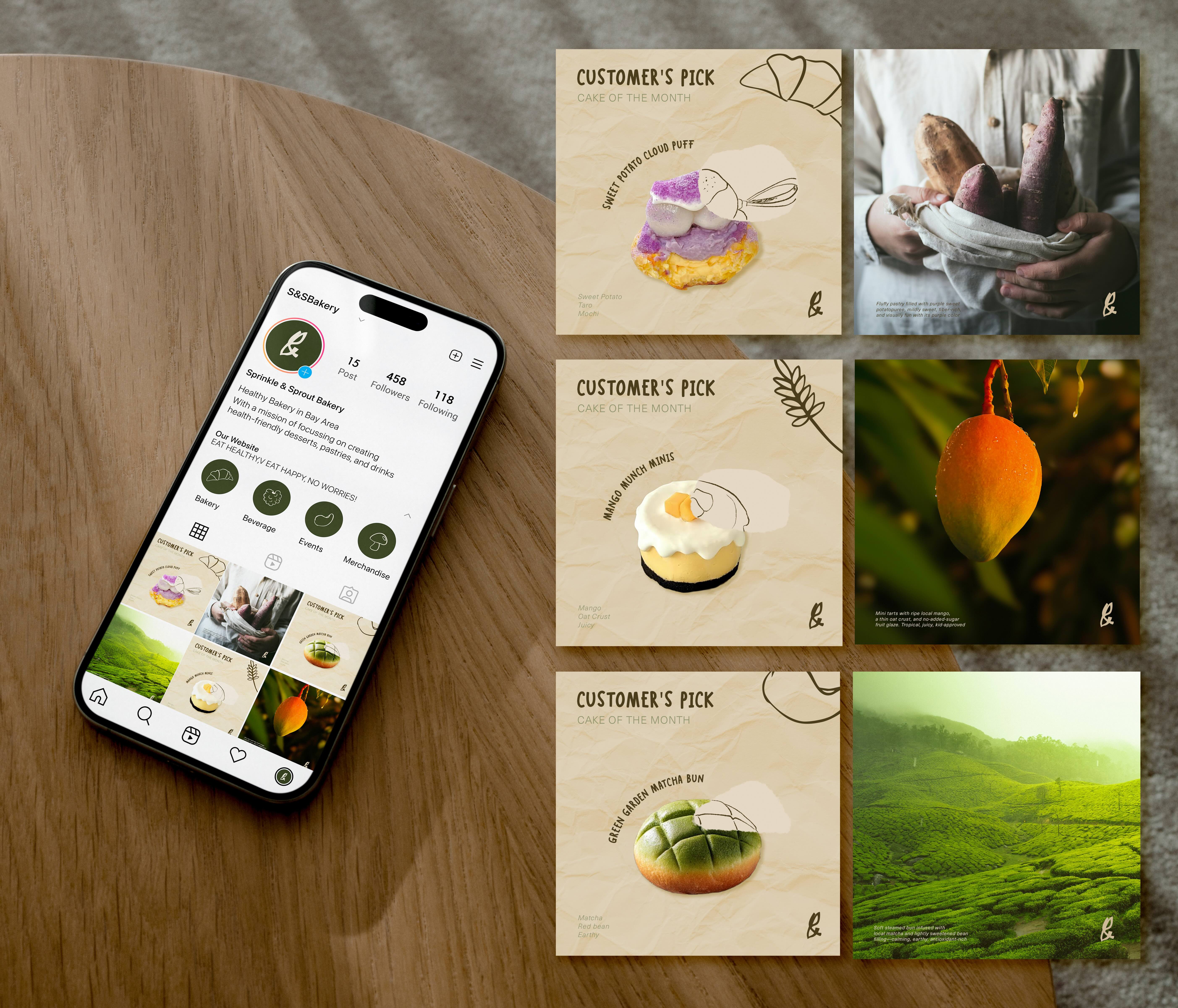
  • Focused on Instagram as the primary platform for brand awareness
  • Proposed collaborations with sports brands, eco-friendly fashion brands, and art toy creators
  • Developed the idea of turning Leafy into collectible art toys to extend the brand beyond food
To build trust and loyalty:
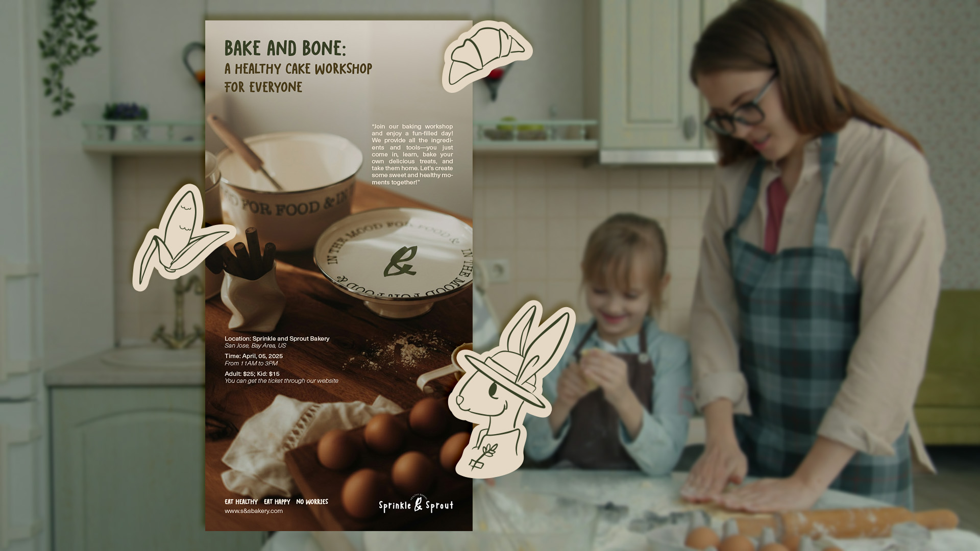
  • Hosted baking workshops where customers can make pastries using the brand’s recipes
  • Created family-friendly events encouraging parents and children to participate together
  • Positioned the brand as an experience and memory, not just a product
Outcome
The final system presents Sprinkle and Sprout as a joyful, trustworthy, and community-driven brand. The identity supports healthy values while remaining playful, affordable, and emotionally engaging.
What I Learned
This project helped me understand the importance of combining market research, storytelling, and creativity when building a brand. I learned how thoughtful branding can address real consumer concerns while still feeling fun and inviting.
Why This Project Matters
Sprinkle and Sprout reflects my interest in designing brands with purpose, where visual identity supports well-being, sustainability, and human connection rather than trends alone.