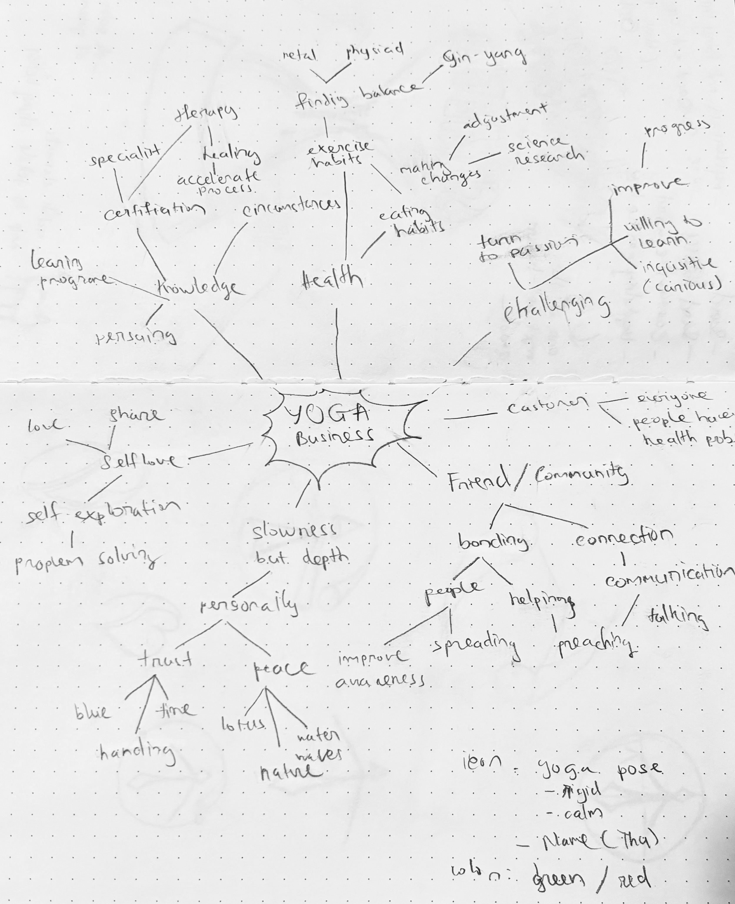
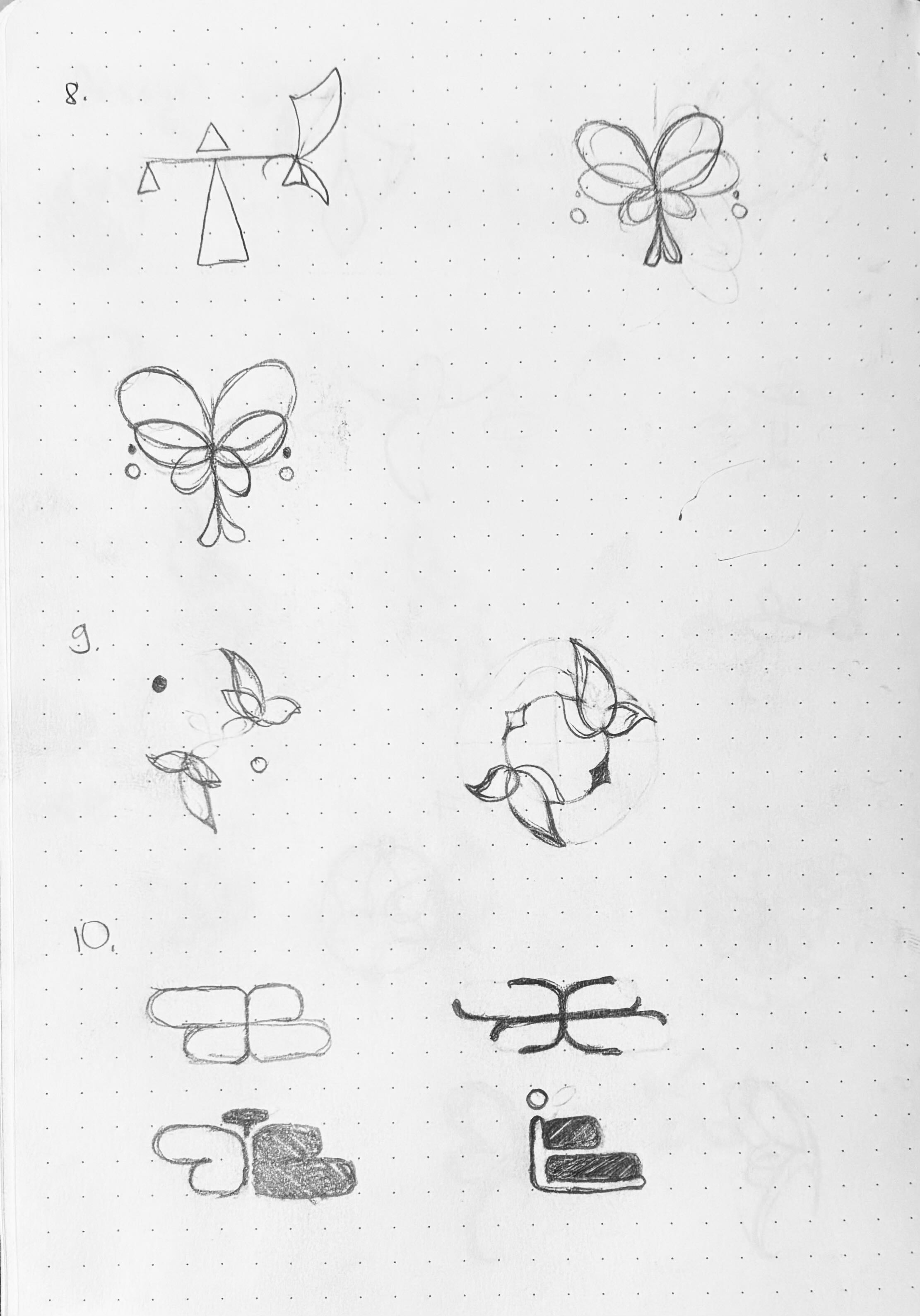
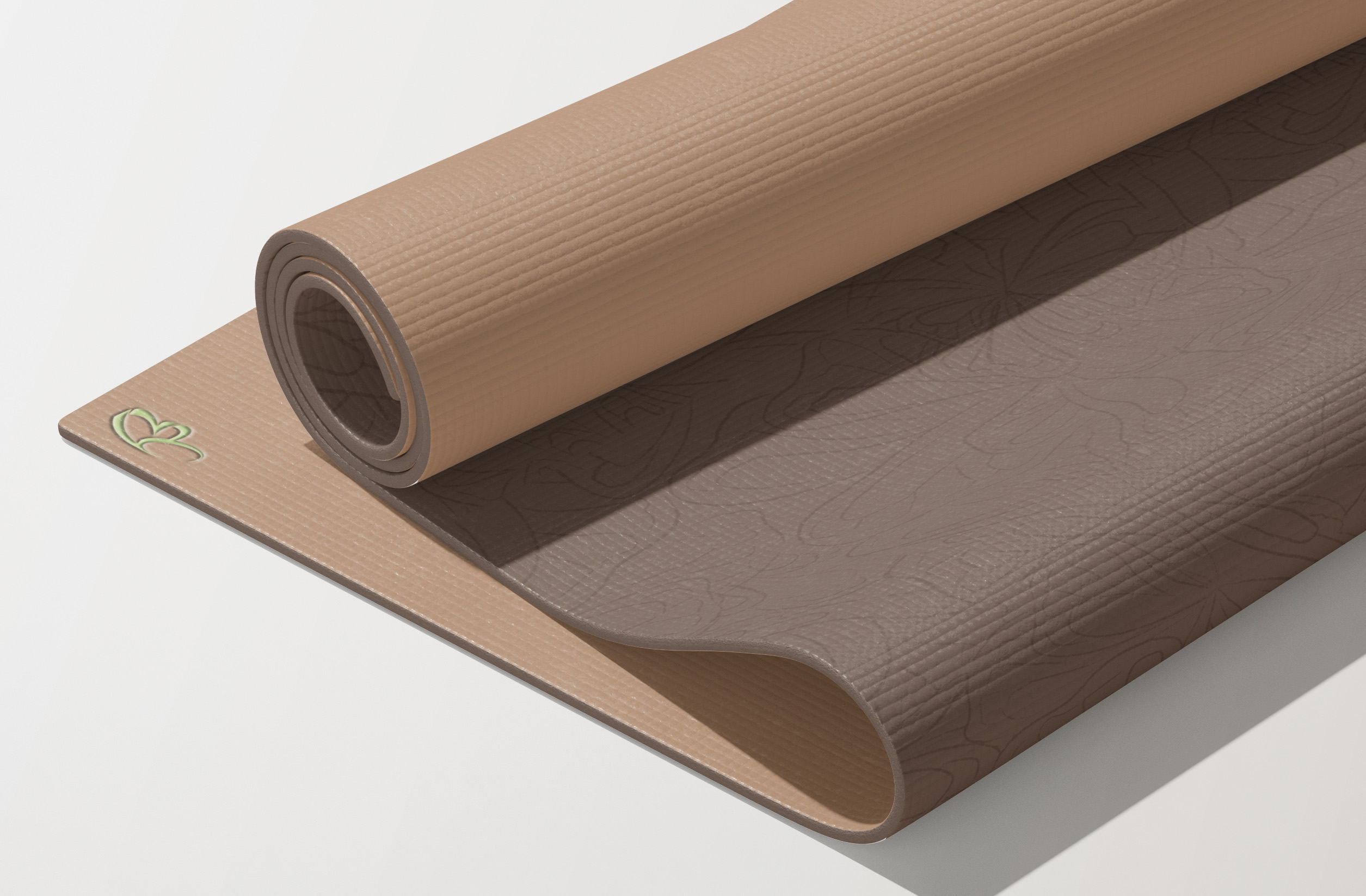
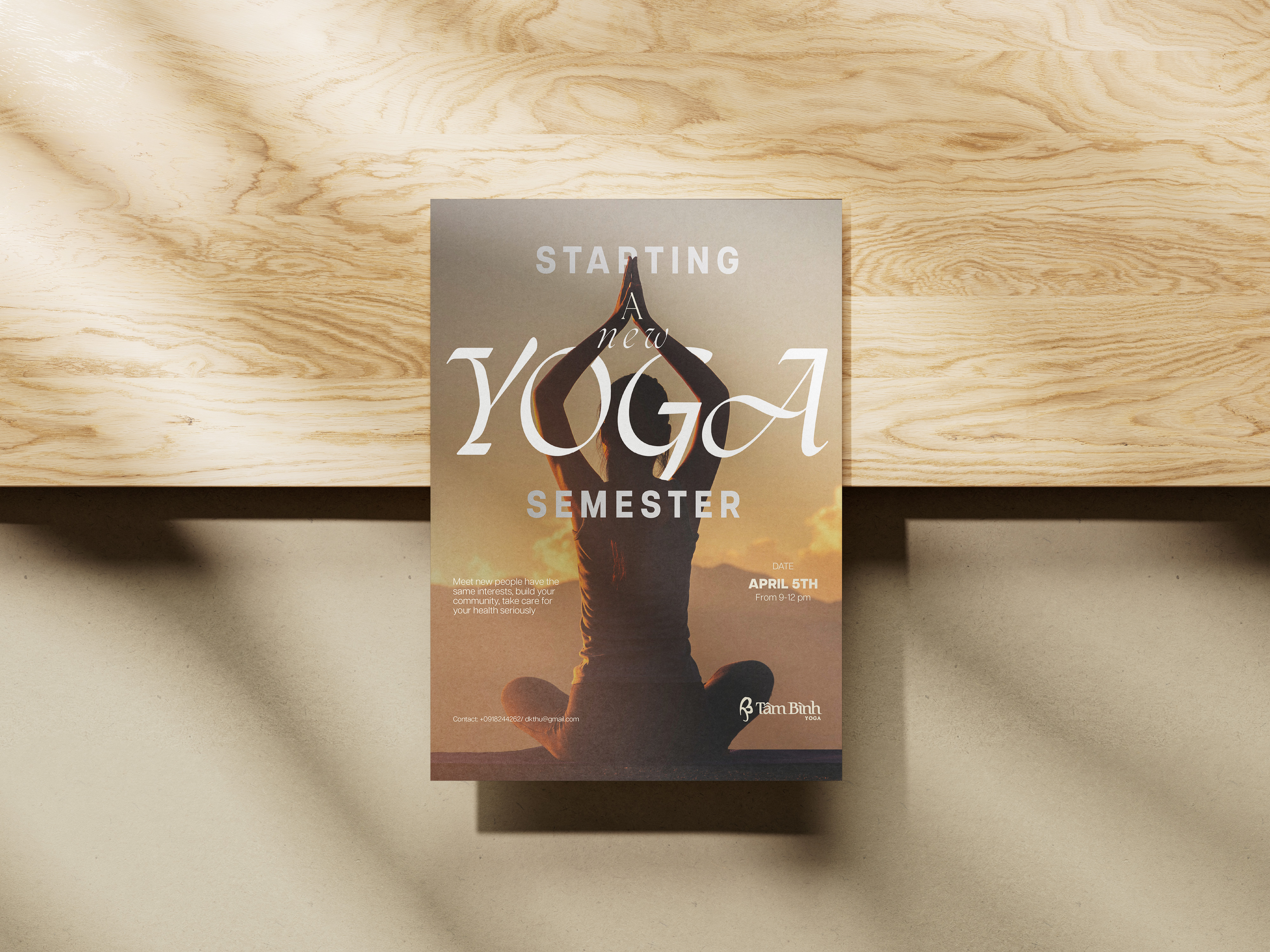
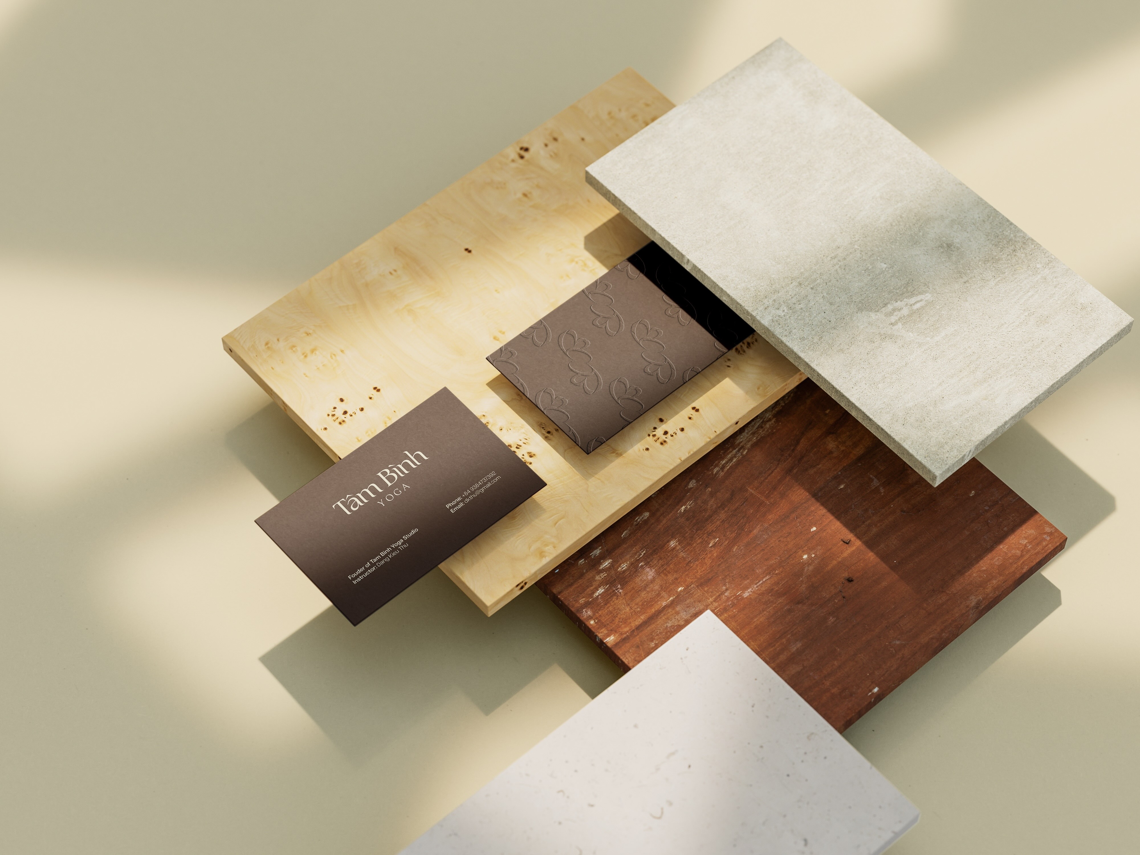
Tam Binh Yoga Studio

Brand Visual Identity
Project Overview
Tam Binh Yoga Studio is a small local business established in 2023 in Vietnam. The studio focuses on creating a welcoming environment where people can reconnect with themselves through yoga, meditation, and community.This project developed a cohesive visual identity that reflects Tam Binh’s philosophy of balance, healing, and simplicity while helping the studio stand out in a competitive wellness market.
Goal
  • Create a calm and trustworthy brand identity
  • Communicate healing, balance, and mindfulness
  • Differentiate the studio from competitors
  • Build a professional yet inviting presence for the local community
My Role
Brand Designer (Individual Project)
  • Brand concept development
  • Logo design
  • Color palette and typography selection
  • Visual identity system and applications
Design Concept
The brand is conceptualized as a healing space—minimal, grounded, and free from distraction.
Tam Binh aims to be a place where people can return to their center through mindful movement, breath, and inner balance.Natural materials, meditation music, and subtle sensory elements inspired the overall design direction, emphasizing harmony between body, mind, and environment.
Key Design Decisions
Color Palette
  • Together, the palette evokes peace and supports focused breathing and meditation
Log Design
  • Inspired by the image of a butterfly, symbolizing resilience, transformation, and inner growth
  • Integrated with the initials “TB” from the studio’s name
  • Moves away from the typical lotus imagery often associated with yoga
  • Represents yoga as a journey of self-discovery and balance
  • The ribbon element within the logo symbolizes community, connection, and support, reinforcing the studio’s mission to bring people together
Marketing & Campaign Strategy
  • Season typeface was selected for its clean strokes and elegant curves
  • Conveys professionalism, trust, and warmth
  • Fully supports Vietnamese language usage, ensuring accessibility across all marketing materials
  • Neutral tones combined with earthy brown and green
  • Brown represents stability and grounding
  • Green symbolizes vitality, calmness, and renewal
Outcome
The final brand identity presents Tam Binh Yoga Studio as a peaceful, professional, and trustworthy destination for wellness. The visual system helps the studio establish a clear presence while remaining approachable and deeply connected to its values.
What I Learned
This project was one of my early experiences in branding and helped me understand the importance of storytelling in identity design. I learned that a strong brand is not only visual but emotional—built through intention, consistency, and meaning.
Why This Project Matters
Tam Binh Yoga Studio reflects my interest in designing for wellness and community, where visual identity supports emotional well-being and human connection rather than visual noise.