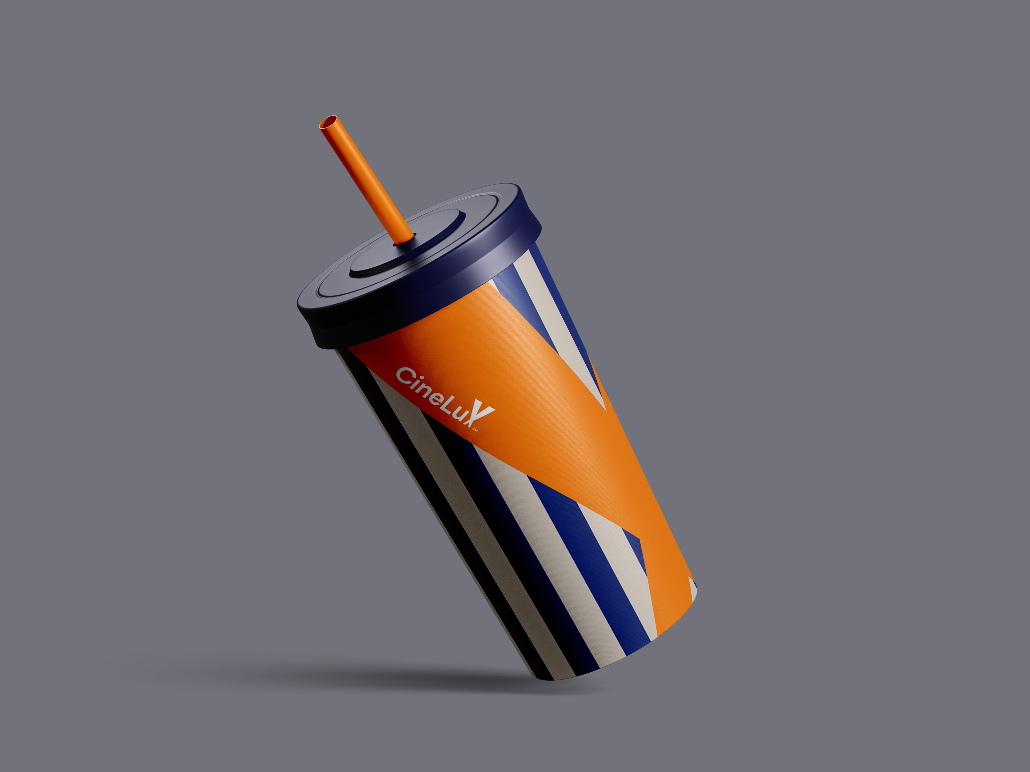
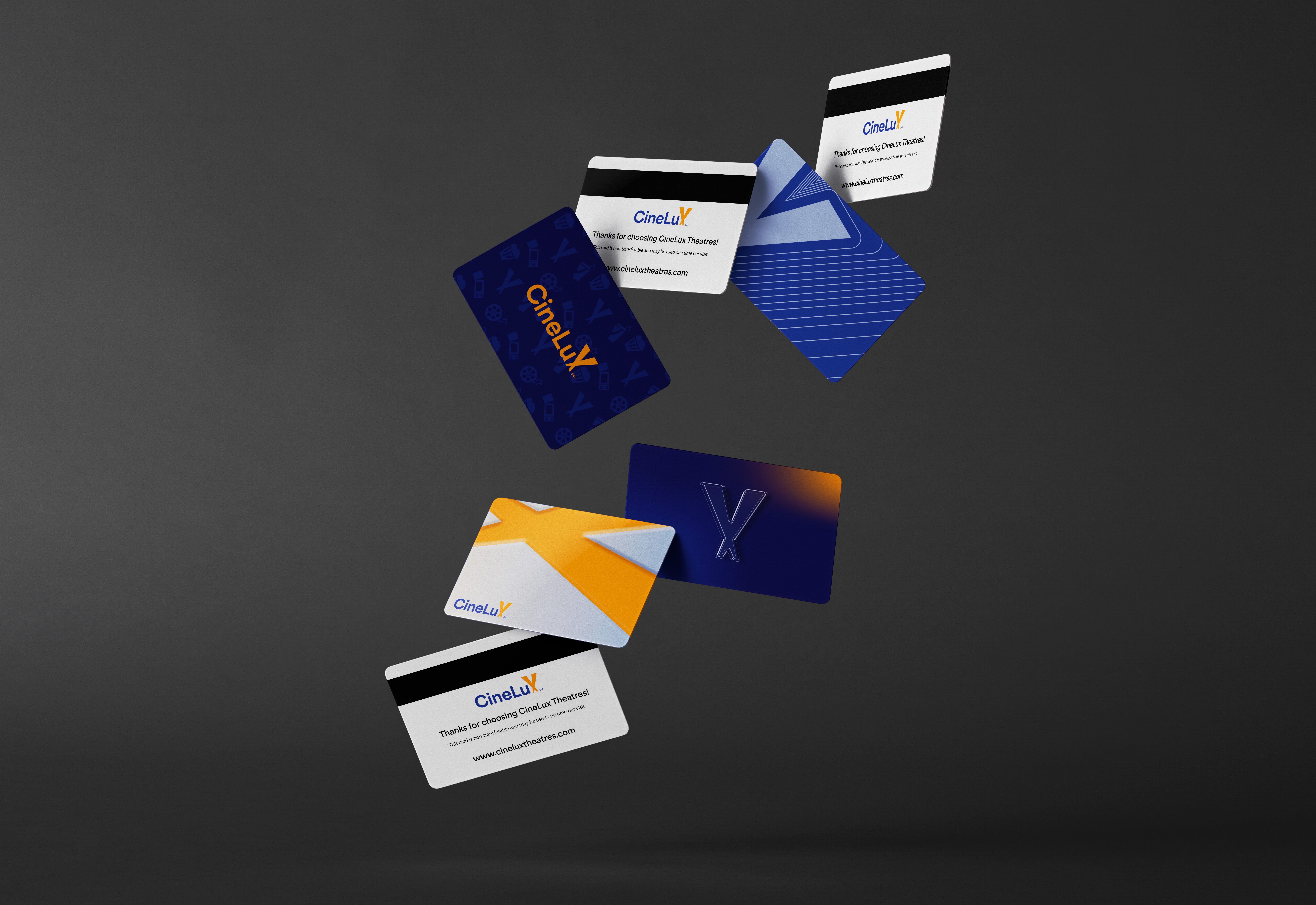
Cinelux

Rebrand & Marketing Campaign
Project Overview
Cinelux is a small local movie theater established in 1966 in the Bay Area. Known for affordable pricing and community-oriented services, Cinelux carries a legacy of entertainment rooted in bringing people together.This project reimagines Cinelux’s visual identity and marketing system to better communicate its values and connect with new audiences while respecting its long-standing history.
Goal
  • Create a cohesive and recognizable brand identity
  • Increase customer awareness of Cinelux’s services
  • Communicate a sense of belonging beyond entertainment
  • Modernize the brand while honoring its legacy
My Role
Main Designer (Team Project)
  • Led visual identity and rebrand direction
  • Designed logo refinement, brand system, and color palette
  • Created all marketing graphics and social media templates
  • Developed campaign concepts and visual applications
Design Concept
The concept centers on Cinelux as a “home theater”—a welcoming space where families and communities gather, rather than a high-end or exclusive cinema.

Instead of replacing the original identity, I focused on evolving the existing brand, maintaining familiarity for long-time customers while creating a clearer, more modern system for new audiences.
Key Design Decisions
Logo & Typography
  • Retained the original logo idea while refining its form
  • Customized the logo to emphasize the letter “X” in Cinelux
  • Selected Area as the primary typeface for its rounded forms and versatility
  • Utilized the font family’s wide range of styles to support multiple platforms
Color Palette
  • Blue and orange were chosen as complementary colors
  • Blue communicates trust and reliability
  • Orange adds energy, creativity, and warmth
  • The palette helps Cinelux stand out from competitors
Marketing & Campaign Strategy
  • Focused on Instagram as the primary platform to reach younger audiences and families
  • Designed cohesive templates for promotions, movie releases, and announcements
  • Proposed a ticket reward system that encourages repeat visits and community engagement
  • Seasonal ticket designs allow for collectible campaigns and ongoing visual refreshes
  • Extended branding into merchandise and printed materials
Outcome
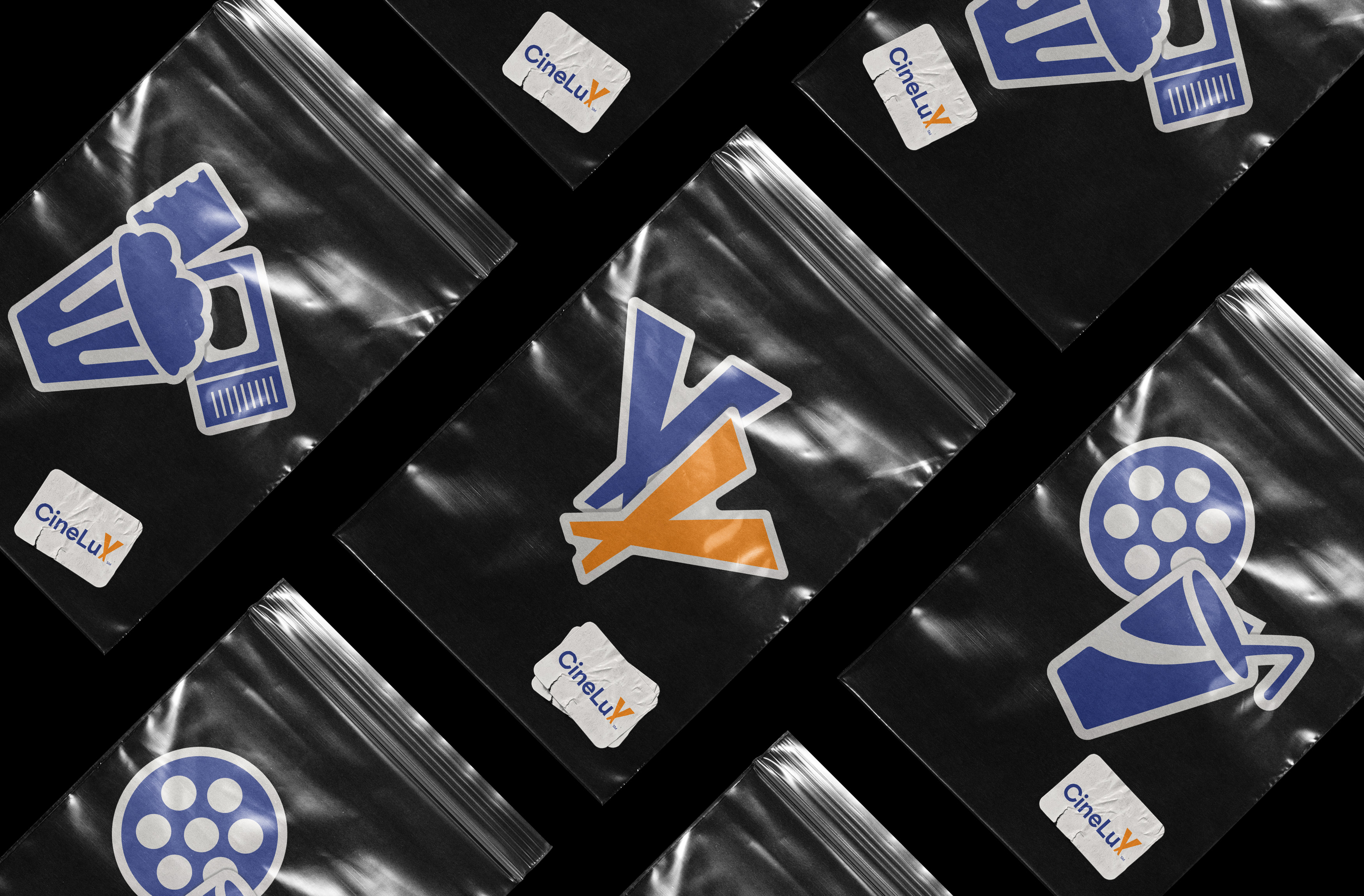
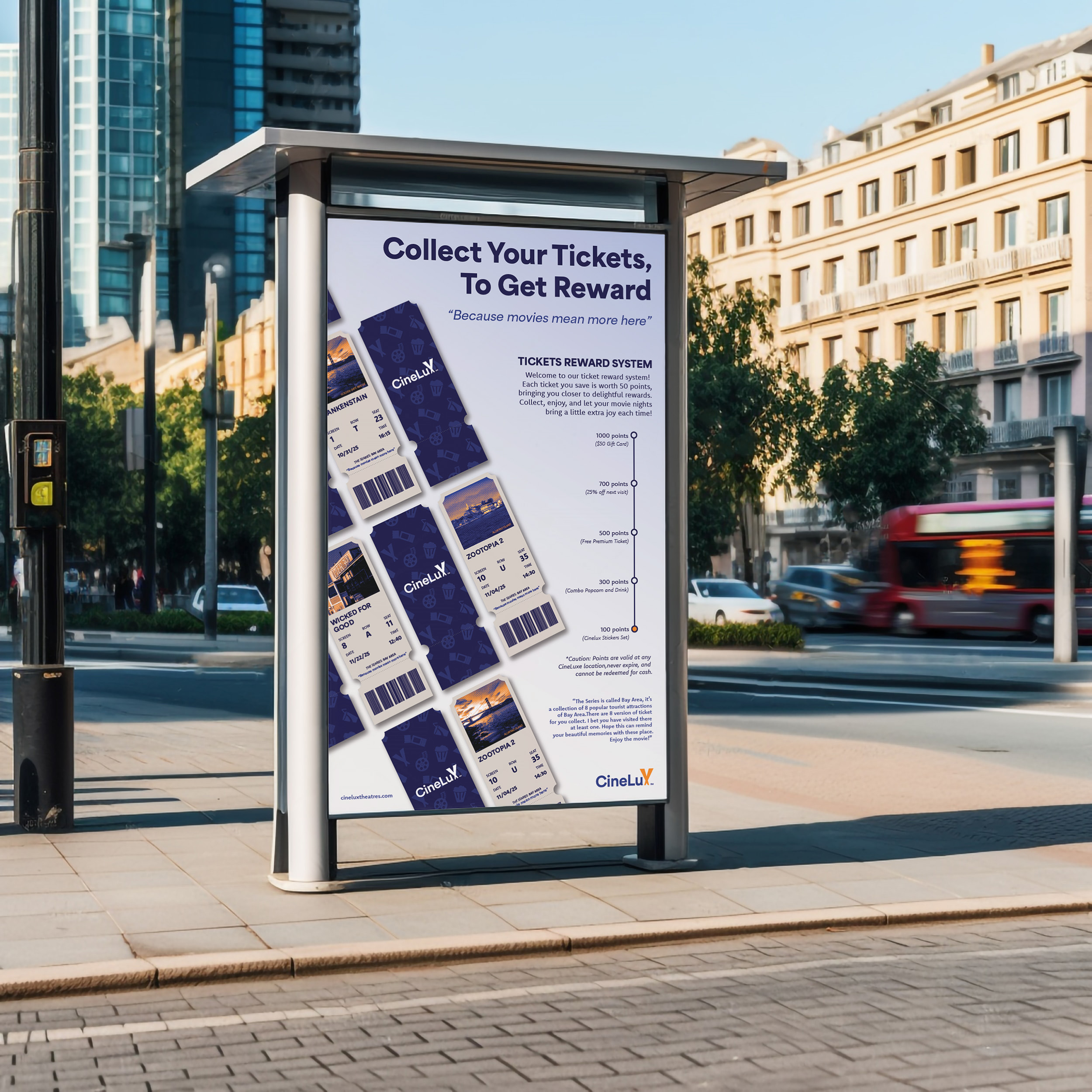
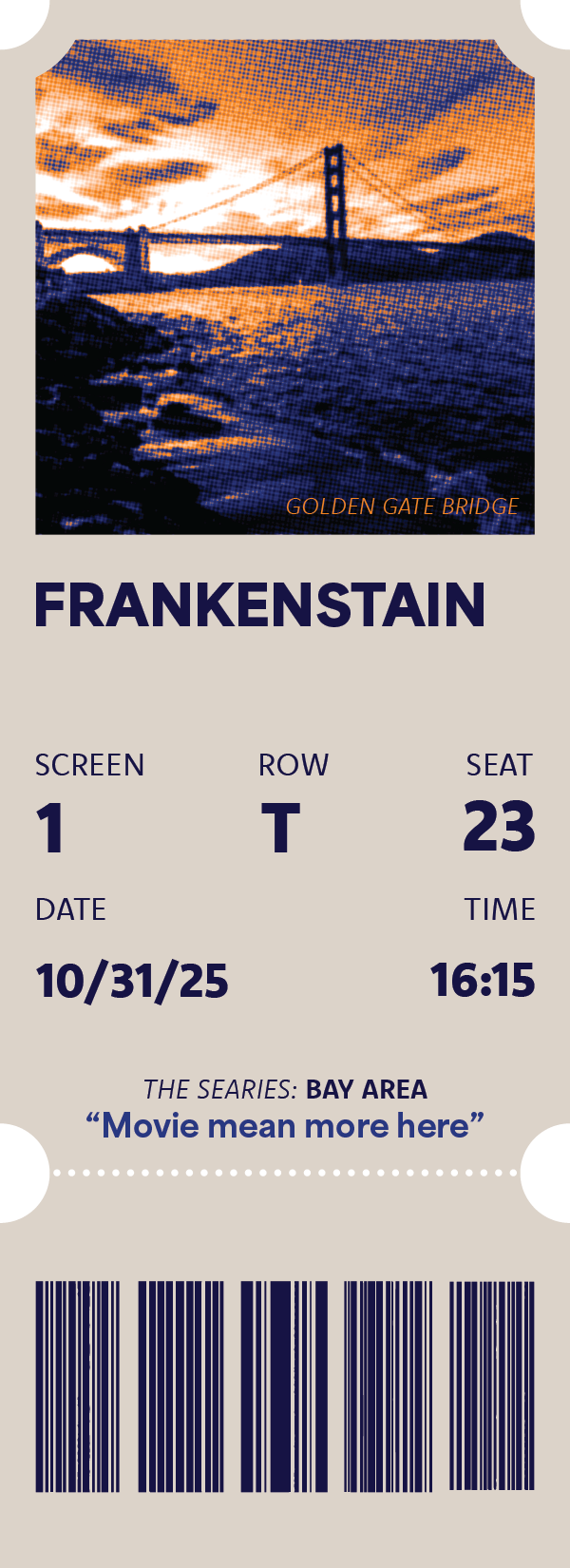
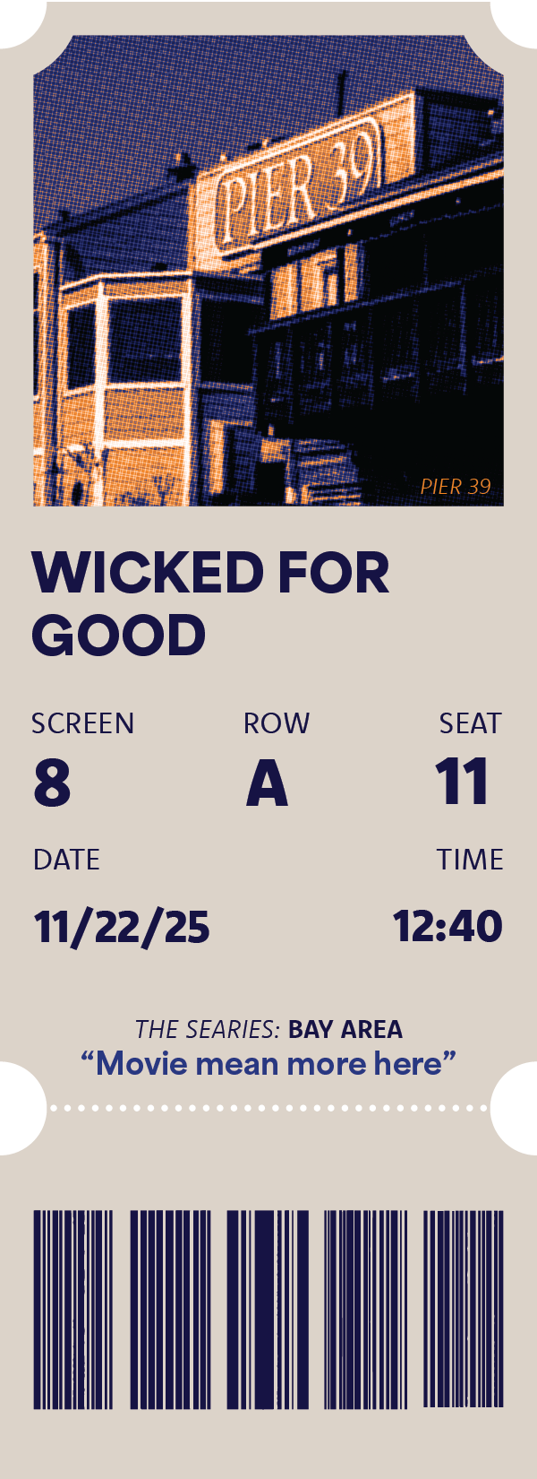
The final rebrand delivers a clear and cohesive visual system that strengthens Cinelux’s identity across digital and physical platforms. The refreshed brand balances nostalgia with clarity, helping Cinelux remain recognizable while appealing to new customers.
What I Learned
This project strengthened my ability to lead design direction within a team environment. Collaborating with others while maintaining creative ownership helped me improve communication, delegation, and decision-making.

Designing for an unfamiliar business reinforced the importance of research in building meaningful and effective brand systems.
Why This Project Matters
Cinelux reflects my interest in designing for community and accessibility, where branding supports connection, inclusivity, and shared experiences rather than exclusivity.